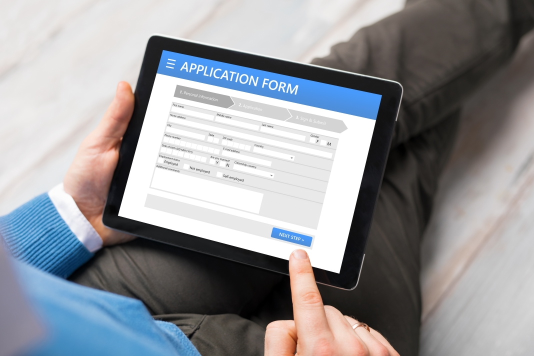
Filling out the form started easily – First name, middle name, surname – well easy for me, but for the guy behind me in the queue, a recently arrived new Kiwi from China, I suspected the form would immediately cause some problems.
I mean, not every culture works by the first name, middle name, surname protocol. Case in point, has anyone ever looked up Singh in the Punjab telephone directory? Most of you will probably answer ‘no’ to that question, but trust me, the directory has a formidable ‘S’ section.
But here’s the thing: The boffins who design the forms are often coders, not designers. The required data fields are all included in the form (along with 27 additional unnecessary pieces of personal information that have exactly nil relevance to the process at hand), so yes, the coder has done his or her job. But for the end-users, the form often doesn’t work and can be prone to elicit worrying levels of swearing from my office.
There’s the form that, despite scrupulous attention on the victim’s part, continues to return an, “all required fields must be completed,” message. despite the fact you’ve completed ‘all the required fields’.
Required fields
Ok this is a small thing, but always concerning: “Zip code” and/or “State” fields – I come from the land down under, and although we do more often than not enjoy Vegemite sandwiches here, we don’t have a state or a Zip code – which is why I always feel uneasily anxious when submitting my purchase form, sent from the state of BOP, that my online purchase will never arrive;
Despite me having paid, I worry my purchase will forever be lost in the ether of “statelessness” somewhere in the back aisles of DHL’s Kuiper Belt depot.
There never seems to be an “other” option for state – it forces me to make up a state – why?: Because it’s a “required field”, of course.
Ok #ihateonlineforms gripe number three: choose your address from the drop-down list. So easy when your address does appear in the list – saves so much typing time and the postcode is probably correct – but, OMG, what to do when your address is not on the list?
I recently offered to pay my daughter’s car registration online – she’s just shifted house and it was by way of a house-warming gift – weird I know! Her new home is a newly built unit on a subdivided section.
Was her new address included in Waka Kotahi’s drop-down list of addresses: NO. Was there an option ‘address not on the list, please specify’, NO.
Where is her registration card being sent? To her neighbour’s mailbox of course … probably (scary face emoji!) … maybe (praying hands emoji!). It was only $112, and you can’t really expect a small government department like Waka Kotahi’s website to make that easy.
I mean even the ‘big guns’ of the government’s form filling battalion don’t always get it right. Take for example the departure and entry forms you’re required to complete at the airport, or onboard the returning flight. They’ve got it right in terms of form size – one DLE card. Nice.
But my full name is relatively “medium” in length, and yet I still have to write in 3pt type (condensed), and that’s just my name.
When it comes to Port and Country of departure, try fitting the following answers in the box: Lubumbashi, Democratic Republic of the Congo, or, Kingstown Park, Saint Vincent and the Grenadines.
No wonder it’s so easy to forget you have an apple in your bag when you’ve had to work so hard on reducing your handwriting to microscopic proportions.
Here’s my suggestion: When your data collection team submit the new on-line or hard copy version of the organisations re-designed customer form for approval, do the following:
- Delete the three most unnecessary data fields (we don’t really need to know their mother’s maiden name or town of birth).
- Triple the size of the three smallest info boxes.
- Halve the size of the two biggest (Mr, Mrs, Ms doesn’t need an entire line).
- Actually, scrap point 3, let’s not even bother with the Mr/Mrs/Ms – I thought we were supposed to be gender neutral?
- Where the original Silicon Valley coder has put “State” and marked it “required field”, get our coder to do something smart and eliminate that required field if “New Zealand” is chosen for the Country drop-down.
- Okay, you need a timeout for security reasons, but please make it longer than 30 seconds, and offer an intermittent ‘save’ function occasionally in the process, because I don’t know anyone who enjoys filling out an online form three times due to time-outs.
But it’s not all brickbats – let’s finish with bouquets.
Three cheers for the person who decided to tell the customer “up front”, when they sit down to embark on the journey of ultimate despair that is online form filling, what information they will need at the ready before they start – you good thing.
And for the IRD person whose idea it was to introduce the SAVE DRAFT button on myIR GST return form – I vote you for Commissioner of Inland Revenue. Good form.
Related: Not the six o’clock news


